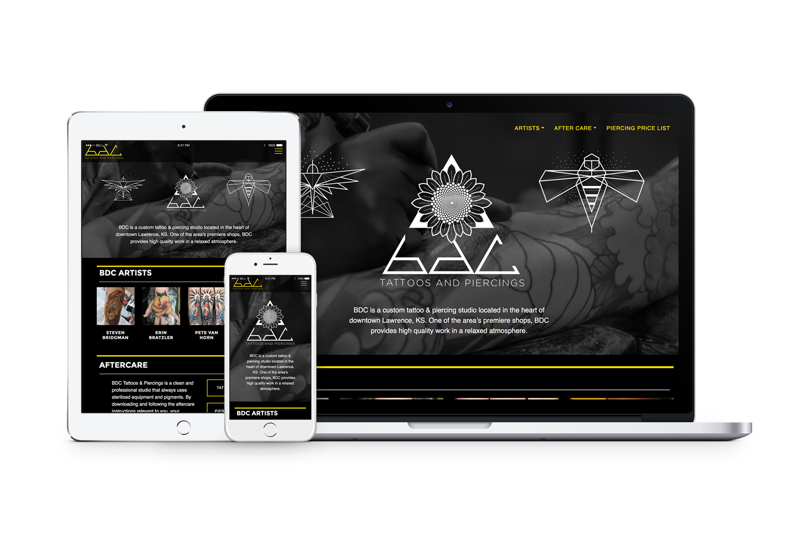
A few years back, BDC underwent an ownership change and the tone of the brand shifted in the process. However, they hadn't yet gone through an official rebrand process. Other than retaining the existing name, BDC Tattoos and Piercings, everything else was on the table for an update.
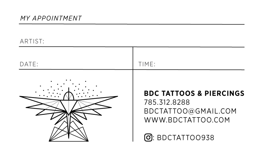
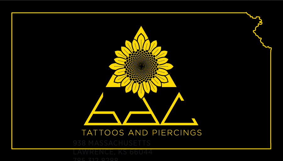
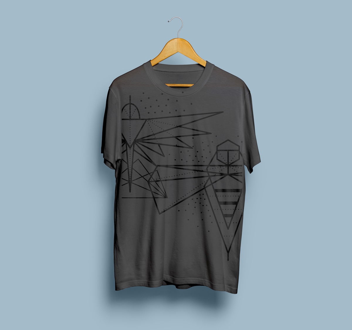
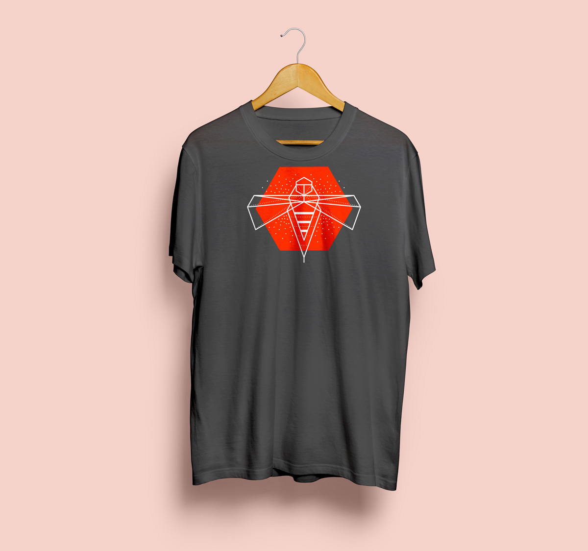
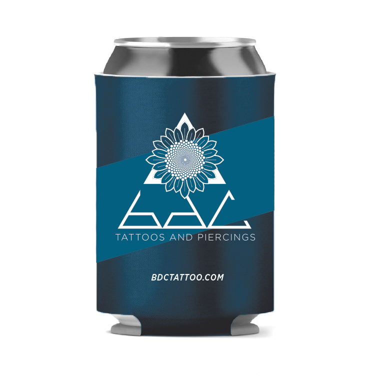
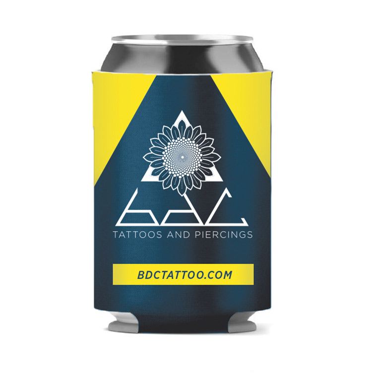
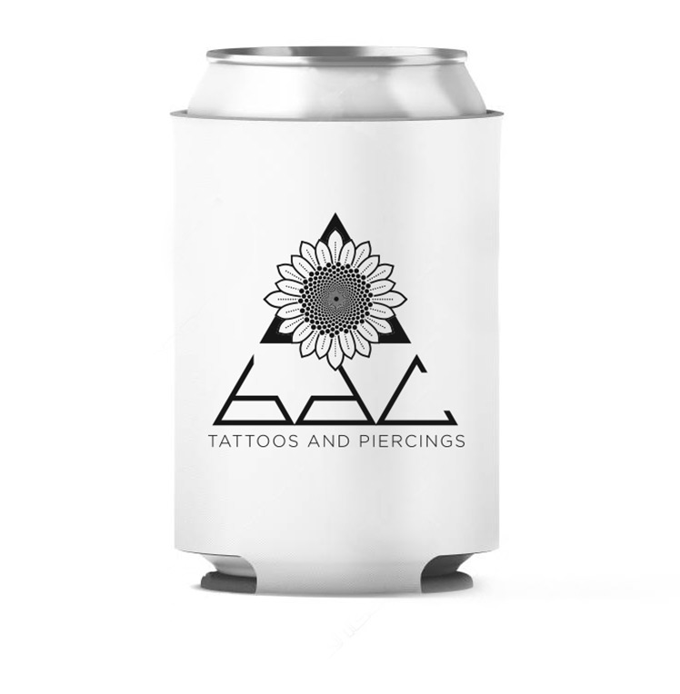
BDC asked to have elements of sacred geometry included in the brand as well as ties to the local/regional community. The new brand consisted of a three logo set: A primary logo with a sunflower, the state flower of Kansas; a bee, the state insect to represent the piercing side; and a phoenix rising from fire, a beloved symbol of the city, to represent the tattoo side.
The design system extended out to include a stationary set, website, pricing sheets, apparel, signage, and social media icons.


Web programming: Greg Barry